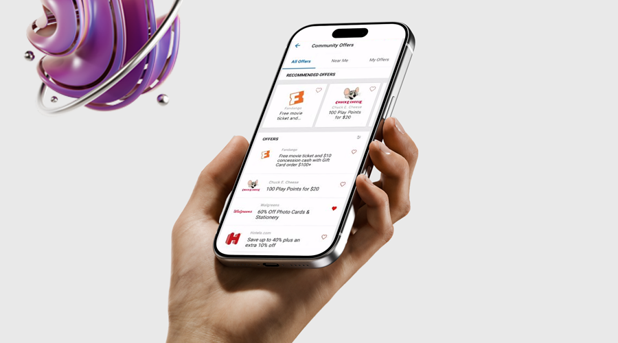
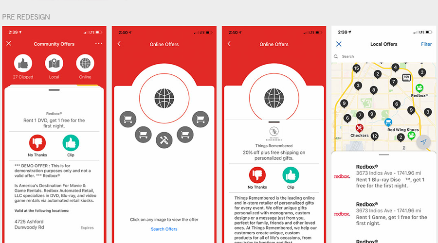
Case - Statefarm: Community Offers  

  • UX/UI
  • Product Design

Redesign for Rewards Program: Reasearch showed early attempts to innovate with a unique user experience. Prior usage was cha;;enging and complicated to customers. UX was now tasked to enhane user experience and merchant portal and breath NEW LIFE into the program.     

  • UX/UI
  • Research
  • Visual design
  • Prototype
  • Visual library design

  • Date:2019
  • Client:Statefarm
  • Budget:Contract
  • Art Director:Sante/Staff

What were we Solving for?

Why wasn't the program working? How could we improve it?
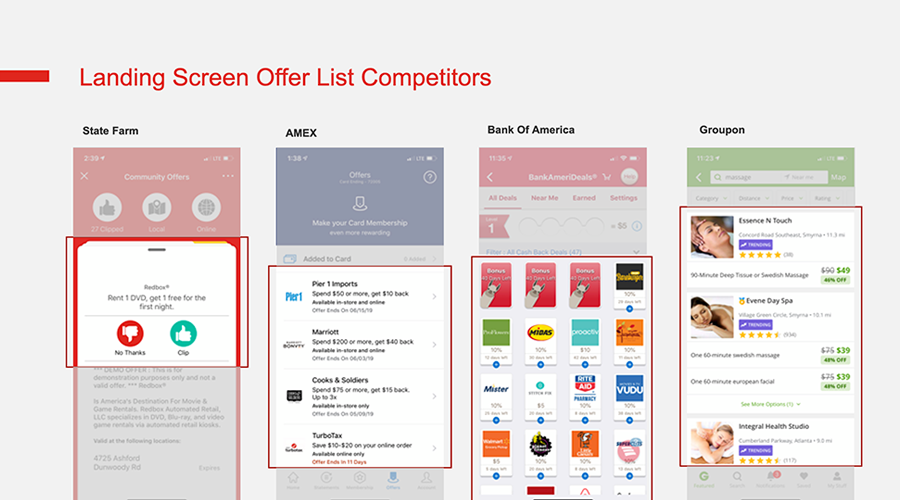
We began our discovery phase with a PM review and followed heuristic evaluation of the mobile app and desktop responsive user experiences. We conducted a competitive analysis by collecting and comparing data about competitors similar products and value propositions.

These methods were useful to examine, understand and evaluate our direct and indirect competitors solutions, highlight products strengths and weaknesses to help us make informed decisions about our product and design strategy.

Follow the data
Along with the aid of research data from prior usability studies and the presentation of our competitive analysis, we were able to convince our business partners and significant usbility and technology flaws needed to be addressed to improve performance metrics.

We proposed that a bottom-up reface was in order to address fundamental usability issues. The design was also outdated and needed to be updated to the existing corporate style guide and standards.

The outcome was expected to:

  • Increase user engagement
  • Improve user satisfaction
  • Make the program significantly more attractive to customers, merchants, and agents
  • We employed various methods and activities to flesh out ideas and prioritize efforts. Stakeholders from UX, business, data and engineering were all influential in these sessions. This helped us facilitate a shared vision and alignment on goals and next steps.
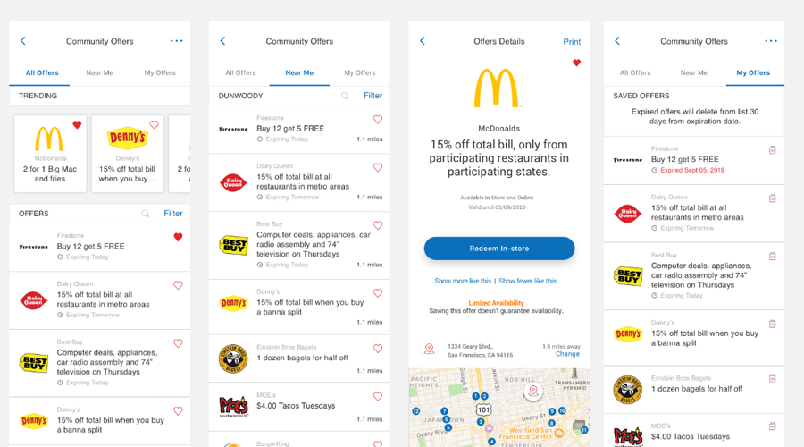

Wireframes & Visual Design

With a solid understanding of our short-term and long-term goals. I started with user flows of the existing desktop and mobile experiences. We shared these flows with business shareholders which helped us map out a plan of execution. Stories were created, added to an agile board, and planned during sprint cycles.

Over the following weeks and months, we turned ideas into rough comps, which became wires. Throughout this process, we shared designs with shareholders to get their input. Updates were made based on this feedback.

After wireframes were approved, visual design mockups were created following UX design style guidelines. This ensured proper usage of colors, typography, iconography, etc.


Test, Evaluate and Improve

Internally, we felt our new design was a dramatic improvement and the application would perform much beter for users, merchants and agents. However, to test some of our assumptions we pit together clickable prototypes and worked our CUSTOMER INSIGHTS DEPARTMENT to design usability studies. These studies were conducting in our Atlanta usability lab and my team virtually monitored.

The results of our studies provided us with valuable insight we were able to enhance the solution. Approved designs were delivered to our development team to implement. We worked closely with our Product team and developers to maintain the intergrity of the designs as well as to support their questions and.or concerns, Occasionally, mid-development design adjustments were necessary due to practicality or time constraints.