Case - Walgreens: DVAR  

  • UX/UI
  • Product Design

Walgreens is the second-largest retail pharmacy chain in the United States, with over 8,700 locations providing prescription drugs, health products, and, in many cases, vaccines and, photo services.

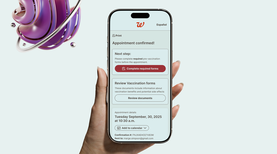
In a pharmacy context, specifically within Walgreens systems, DVAR stands for Digital Vaccination Administration Record.

  • UX/UI
  • Research
  • Visual design
  • Prototype

  • Date:2025
  • Client:Walgreens Digital
  • Budget:Contract
  • Art Director:Sante/Staff

What were we Solving for?

The Problem

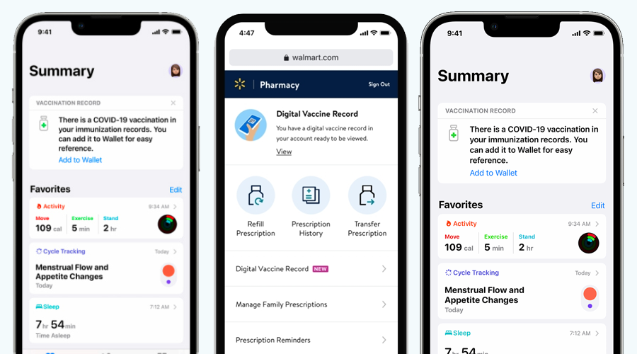
  • Secure sign-in using an email address or phone number associated with your Walgreens account
  • Access to pharmacy features such as prescription refills, transfer requests, and medication history
  • Ability to manage family members’ prescriptions from a single account
  • Personalized reminders, refill alerts, and pharmacy notifications after sign-in

The Research

  • First-time account creation test: Observe how new Walgreens customers understand required fields (email, phone number, password) and where they hesitate or make errors.
  • Returning user sign-in speed test: Measure how quickly existing customers can sign in using saved credentials, biometrics, or autofill.
  • Forgot password recovery test: Evaluate whether users can successfully reset their password without confusion or abandoning the flow
  • Two-factor authentication comprehension test: Test if customers understand and trust one-time passcodes sent via SMS or email.
  • Error message clarity test: Check how well users understand error states such as incorrect password, expired code, or locked account.
  • Accessibility and readability test: Validate font size, contrast, and screen reader compatibility for older users or those with visual impairments.
  • Family account access test: Observe whether users can easily sign in and switch between their own and family members’ prescriptions.
  • Cross-device sign-in consistency test: Test sign-in behavior and expectations across mobile app, tablet, and desktop environments.


Competitive Benchmarking

Much of the research had been documented from earlier designs. Mine consisted more from interviewing SME and interstore pharmacy teams and comparing to other similar systems.


Design

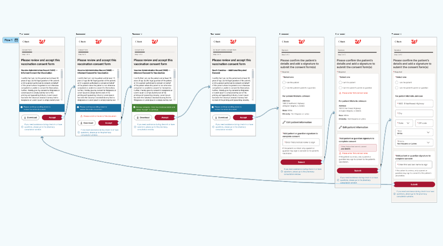
Design phase (Flow maps, FIGMA designs, prototypes, workshops, iterations and Development handoff)

Because we already had current designs in production, we didn’t require loose sketches and moved to loose arrangements taken from requirements and DESIGN LIBRARY components.


Prototype & Testing

Then we went in to validate designs with real users and development. To do this I would once again conduct Usability Tests just like I had done at the start of the project.

TThe objectives of testing the prototype at this point are:
  • Gain insights from the user
  • See if meet users expectations
  • Check if design is matching the goals
  • Check if the user can perform the tasks proposed
  • Find out if we are the right track
  • Get user reactions and feedback


Conclusion/Outcomes

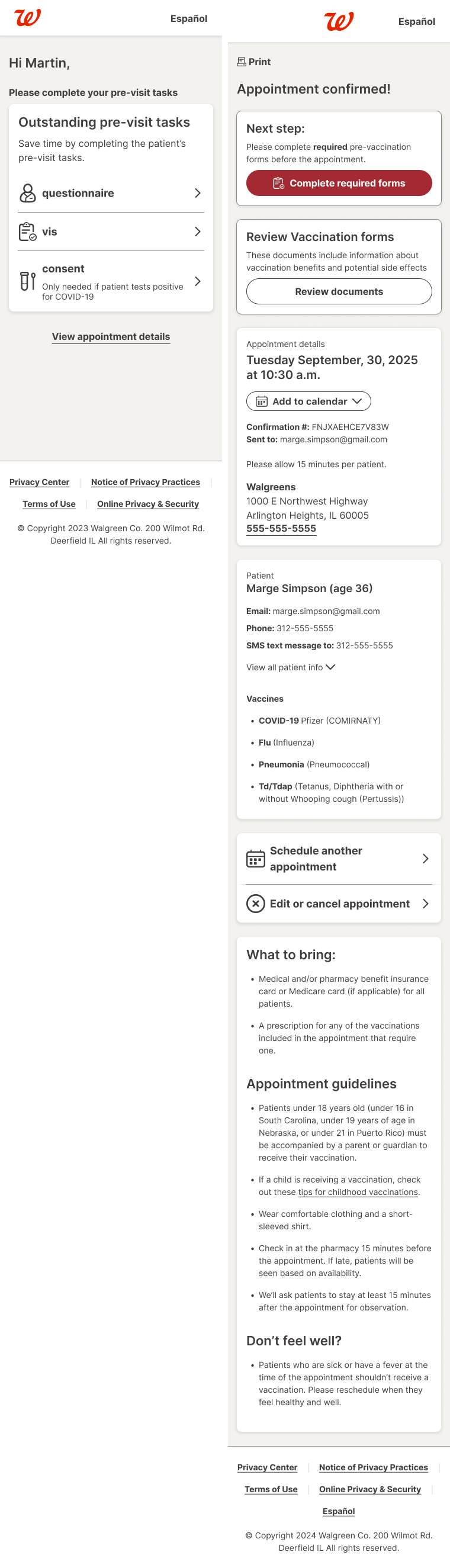
The UX process I followed every bit of the final flow and design of the appointment process. Here are the main areas I addressed that are somewhat of a bottleneck.

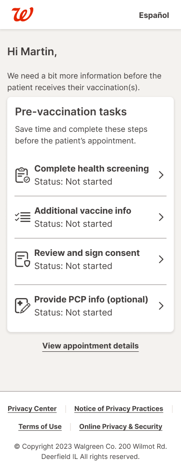
  • Streamlined form fill out and filled gaps in slightly slow and ambiguous design.
  • Improved on interactions, flow and introduced new policy assistance.
  • Added to deliverables with the starting direction for NEW landing page.