Case - Statefarm: Drive Safe & Save  

  • UX/UI
  • Product Design

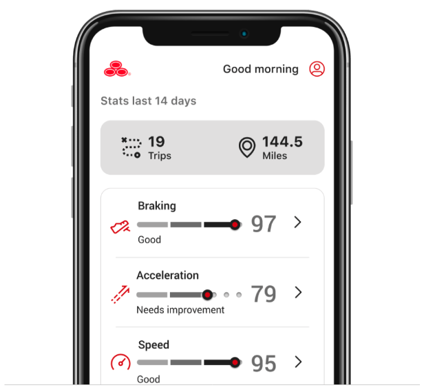
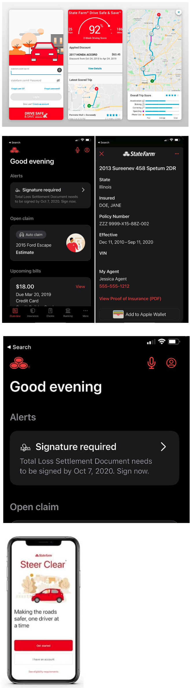
Drive Safe & Safe is a discount for participating customers and does not surcharge your policy. The Drive Safe & Save discount is based on how you drive.

The aim of the Drive Safe & Save redesign is to enhance user experience, increase engagement, and provide clearer insights into driving habits and savigngs, while promoting safer driving through improved functionality and personalization. 

  • UX/UI
  • Research
  • Visual design
  • Prototype

  • Date:2021
  • Client:Statefarm
  • Budget:Contract
  • Art Director:Sante/Staff

The Problem

The goal of the project was to identify the problems of Drive Safe & Save app and design the solutions.

Before its redesign, State Farm's Drive Safe & Save program faced several issues:

  • Clunky User Interface (UI): Users may have found the app or platform difficult to navigate, with outdated design elements that made it hard to access driving data and savings information.
  • Limited Real-Time Feedback: The lack of immediate driving feedback might have hindered users from quickly adjusting their behavior to improve their driving scores and potential savings
  • Unclear Data Usage: Users might have been confused about how driving data was collected, processed, and translated into discounts, leading to concerns about transparency.
  • Inconsistent Driving Scores: Some users may have experienced inconsistencies or delays in receiving their driving scores or savings calculations, reducing trust in the system
  • Battery Drain and Technical Issues: The app may have caused excessive battery drain on mobile devices, or users may have encountered technical issues such as app crashes or Bluetooth connectivity problems.
  • Lack of Personalization: The program may not have offered enough personalized feedback or advice based on individual driving behaviors, limiting its ability to effectively encourage safer driving.
  • Limited Incentives for Safer Driving: Beyond savings, there may have been few incentives or rewards for consistently safe driving, which could have affected user engagement.

These issues likely contributed to a need for a redesign to improve functionality, transparency, and user satisfaction
Research Phase 1

For the research phase of the project I used the follwing methods: Usability Tests, Depth Interviews, Online Survey & Benchmarking.

USABILITY TESTS

  • Navigation Challenges: Users may have struggled to find key features like driving score summaries, trip histories, or savings information due to a confusing or cluttered interface. Testers might have reported difficulties locating the settings or understanding how to review their driving data.
  • Delayed Feedback: Participants in usability tests may have noted delays in receiving real-time driving feedback, making it hard for them to connect their driving behaviors to changes in their scores or discounts.
  • Complex Setup Process: Setting up the Drive Safe & Save device or app (often through Bluetooth) could have been overly complex or prone to errors, with users facing issues like difficulty pairing devices or completing the installation process.
  • Low Data Transparency: Testers might have expressed concerns over the lack of clarity about how their driving data was being used. They may not have easily understood how behaviors like hard braking or speeding impacted their overall score and insurance savings.
  • Battery and Performance Issues: Many users could have reported that the app significantly drained their phone's battery or caused other performance issues, such as lagging or freezing, particularly when running in the background.
  • Lack of Personalization: Usability tests may have highlighted the absence of tailored feedback or personalized driving tips. Users may have felt disconnected from the program, as it didn't offer advice based on their unique driving patterns.
  • Low User Engagement: Some users may have reported feeling disengaged with the app over time due to a lack of interactive features, rewards, or gamification to motivate consistent safe driving.
  • Inconsistent Data or Connectivity: Testers might have reported issues with inconsistent data recording, such as missed trips, inaccurate trip lengths, or problems with Bluetooth connectivity, reducing their trust in the system.

These issues would provide valuable insights for redesigning the Drive Safe & Save program to make it more intuitive, engaging, and reliable for users.


Tasks

Task: Set Up the Drive Safe & Save Device and App

  • Objective: Evaluate how easily users can set up the Drive Safe & Save system, including installing the app, pairing the device via Bluetooth, and connecting it to their vehicle.
  • Key Metrics: Time taken to complete setup, number of errors or obstacles encountered, and user satisfaction with the setup process.

Task: Check Your Driving Score

  • Objective: Assess how intuitively users can navigate the app to view their current driving score and understand what factors influence their score.
  • Key Metrics: Success rate in finding the driving score, time to locate score, user understanding of score breakdown, and clarity of how driving behaviors (like speed or braking) impact the score.

Task: Review Trip Details

  • Objective: Test how easily users can access and interpret the details of individual trips, such as distance, time, and any driving behavior alerts (e.g., speeding, hard braking).
  • Key Metrics: Time to locate trip history, user ability to interpret trip data, clarity of alerts or warnings, and overall satisfaction with the trip summary layout.

Task: Understand Your Savings

  • Objective: Evaluate how well users can access and understand their current savings, how driving habits affect their insurance premium, and how they can potentially increase their savings.
  • Key Metrics: Time to find savings information, user comprehension of the savings breakdown, and clarity on how to improve driving to earn greater discounts.

These tasks would help identify potential usability issues in key areas of the app, including setup, navigation, data comprehension, and user engagement.


Depth Interviews:

Understanding Motivation and Expectations

  • Objective: Explore why users signed up for Drive Safe & Save, theirexpectations, and what they hope to achieve.
  • What motivated you to sign up for the Drive Safe & Save program? How did you expect the program to impact your driving habits and insurance premiums?
  • What were your expectations regarding ease of use and the app's functionality?
  • How do you feel about usage-based insurance programs in general?

Initial Setup and Onboarding Experience

  • Objective: Investigate the user's experience with setting up the app and device, from downloading the app to installing the in-car device.
  • Key Questions: Can you describe your experience setting up the Drive Safe & Save app and device?
  • Did you find the instructions clear and easy to follow? If not, where were the pain points?.
  • How satisfied were you with the overall onboarding process?

Navigation and App Functionality

  • Objective: Assess how users interact with the app on a daily or weekly basis and understand if they find it easy to navigate and use.
  • Key Questions: How often do you use the Drive Safe & Save app? What do you typically use it for?
  • Is it easy for you to find important features, like your driving score or trip details?
  • Have you ever struggled to find specific information in the app? If so, what was it, and how did you resolve it?
  • Do you feel that the app provides enough useful data to help you improve your driving or increase your savings?

Task: Understand Your Savings

  • Objective: Evaluate how well users can access and understand their current savings, how driving habits affect their insurance premium, and how they can potentially increase their savings.
  • Key Metrics: Time to find savings information, user comprehension of the savings breakdown, and clarity on how to improve driving to earn greater discounts.

Insights from Depth Interviews: These interviews would provide a comprehensive understanding of user motivations, experiences, pain points, and expectations. By analyzing recurring themes, State Farm could identify areas for improvement, prioritize new features for the redesign, and address specific user concerns around ease of use, data transparency, and driving feedback.


Survey:

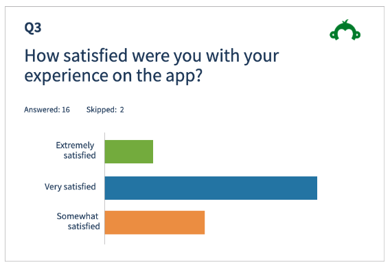
We sent out 1 Survey that was completed by 40 people (in a real world project I would have aimed to get over 100 responses) We used Survey Monkey for the form which consisted of 15 questions. To get the maximum response, I outlined that there were just 15 questions and only take 4 minutes to complete. I used open ended and cloned questions.


Competitive Benchmarking

During the Competitive Benchmarking phase I reviewed 2 mobile similar apps and benchmarked them to learn what they are doing well. Statefarm is already the leader in this field and most companies are following this lead.


Analysis Phase 2

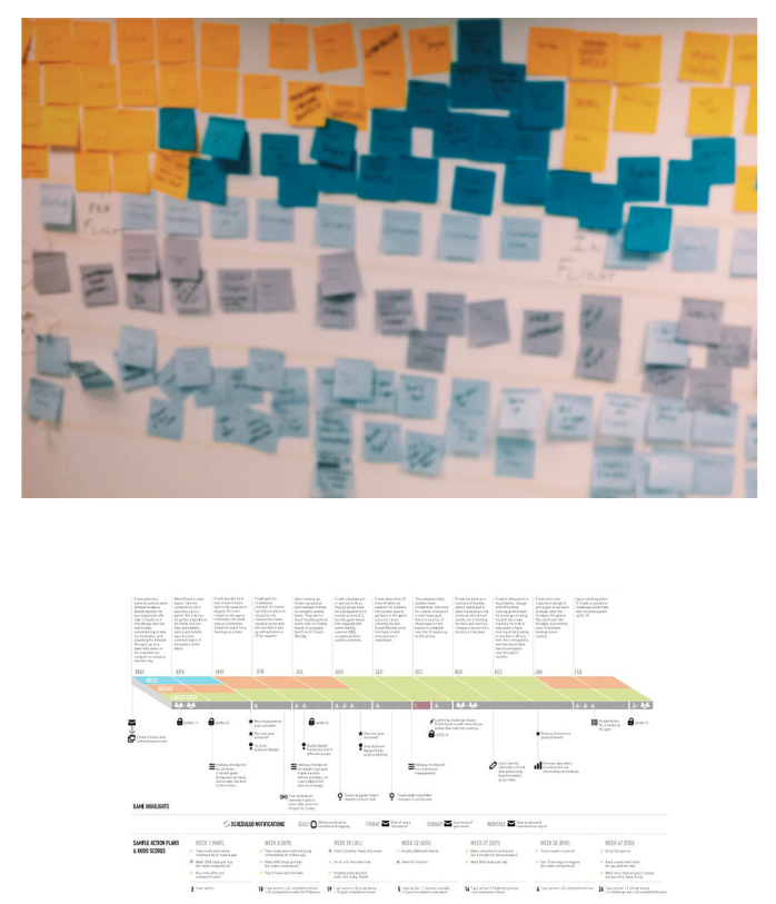
Through the research methods highlighted above, acquired a large amount of raw data - both quantitative and qualitative. The goal of the research had been to identify the problems Drive Safe & Save should be solving for users. Now, using the triangulation (multiple data sources as away to provide a more accurate understanding of the problem to be solved), it was time to analysis that data. The first thing I did was reviewed all the data that I had compiled, jotting down onto post its. From these post-its. I created an Anfinity Diagram, grouping post its and naming these groups in a logical fashion.

I then used the Affinity diagram as a basis for a Customer Journey Map which gave me a structured overview of how the users feels as they go through the booking journey.


Design Phase 3

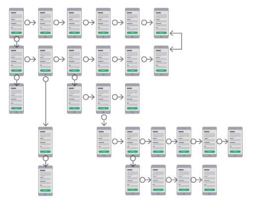
My design process would include Flow Diagram, Re-Defining Navigation and Sketching FLOW DIAGRAM

Before getting into the layout of the app, I wanted to create a high level Flow Diagram to address issues highlighted in my Customer Journey Map. I first sketched out the general flow, getting verygranular and going back and forth until I was happy with the iteration. I then translated my sketches to digital format using FIGMA.

During the translation to digital I noticed other small issues I didnt spot while sketching, so I began to dynamically update the flow as I worked and learned more about the journey. This is something I would do throughout the project, a design is an evolving process that only lets you in on secrets the further you go.

Next step in my design process was to define the navigation style that I thought would accommodate the users flow through the app. Here I could call upon my earlier benchmarking work to see what are the common styles from best-in-class apps.


Sketching/Wires

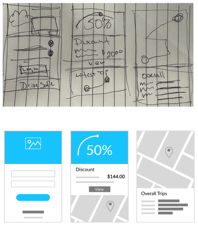
Here I could build on the flow diagram and navigation Ihad already defined and really nail down the layout and interaction design of the screens.

This was in fact a low-fi prototype. I sketched out each screen/iteration on individual pieces of paper and crudely went through the journey by hand as if they were real screen on a phone in front of me.

Physically interacting with the screens helped me identify issues I hadnt thought of previously.


Prototype Phase 4

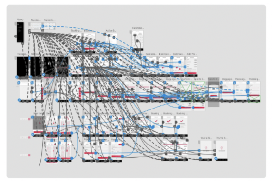
Let's take this online, time to prototype. Transferring the initial screens into FIGMA was a relatively fast process as I had done the heavy lifting during my sketching so it was mostly as case of digitising what I had done, making improvements as I went along.

I decided on a medium fidelity prototype as there weren't many forms or other types of validation or very detailed areas that might need addressing in a high fidelity prototype.

I used the native prototyping functionality in Figma with some light animations to add some flare to the design.


Testing Phase 5

Now it was time to validate my designs with real users. To do this I would once again conduct Usability Tests just like I had done at the start of the project.

The objectives of testing the prototype at this point are:

  • Gain insights from the user
  • See if we meet users expectations
  • Check if the design is matching the goals
  • Check if the user can perform the tasks proposed
  • Find out if we're on the right track
  • Get user reactions and feedback

I wanted to use the same tasks as I had used previously so I could compare accurately if my designs had solved some of the problems I had found in their booking process.

Conclusion/Outcomes

The UX process I followed influenced every bit of the final flow and design of the onboard process.
Here are the main areas I addressed that are somewhat of a bottleneck in previous app and which I feel I solved for with my designs.


Here are the main areas I addressed that are somewhat of a bottleneck in previous app and which I feel I solved for with my designs.

  • The addition of more feedback and affordances to the date selection screen removed any confusion for the user and in turn sped up the booking process.
  • Improvements to the directives selection layout and display of information meant that customers could better digest quite a lot of important content and could feel confident in their selections rather than becoming overwhelmed and unsure of what to focus on.
  • Ability to add on without having to go back the start takes away a lot of frustration for users.

Moreover, users feel more comfortable with their use as it removes some pressure when they know can can easily edit without losing any previously inputted details.

What I Learned


The area I took the most learnings from was the comparative usability tests I conducted. It was invaluable to see users interacting with the product and being able to ask questions along the way.

Here are the other main learning points that were revealed through the project.

  • Simplicity goes a long way. Users get overwhelmed very easily if too much information is presented, even if it's valid information, the way it's structured determines whether it's comprehensible.
  • Make sure your recording software is set up correctly, I lost a full session.
  • Me more mindful of leading questions or statements. On reviewing the usability test there were a couple of instances when I went off script and my phrasing could have better.
  • When you're prototyping, know when to stop.
  • Simple things like affordances and feedback go a long way.